Samsung Galaxy Retail Operations Platform
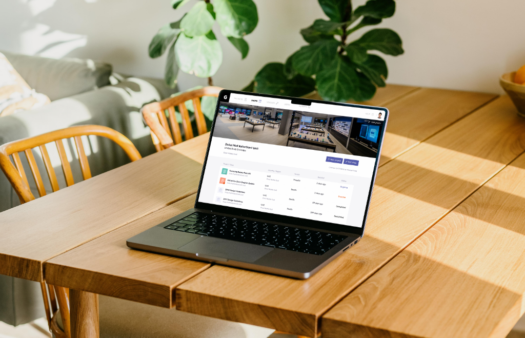
A centralized platform designed to manage global Galaxy store operations, aligning vendor workflows, construction tracking, and store design standards into a single, structured system.
Role
Product Designer
Duration
3 months
Tools
Sketch, Miro
Overview
I led the end-to-end design of an internal web platform used by global teams to manage retail store builds. The goal was to replace fragmented workflows with a system that is clear, consistent, and easy to trust.
- Role: Product Designer
- Platform: Web
- Users: Internal operations teams, vendors, regional managers
Context
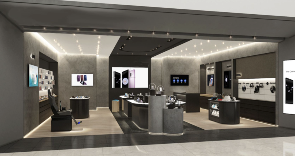
Galaxy retail stores are built across multiple countries, involving different vendors, timelines, and regional requirements. Each project requires coordination across construction progress, vendor responsibilities, and design standards.
Before this platform, information was spread across spreadsheets, emails, and disconnected tools. As the number of stores grew, the lack of structure made it increasingly difficult to manage operations at scale.
Problem
There was no clear system.
Teams struggled to understand the current status of projects, who was responsible, and what actions were needed. Information was inconsistent and often outdated, which reduced trust in the system and increased reliance on manual communication.
This resulted in delays, inefficiencies, and inconsistent store experiences across regions.
Role-Based Experience Design
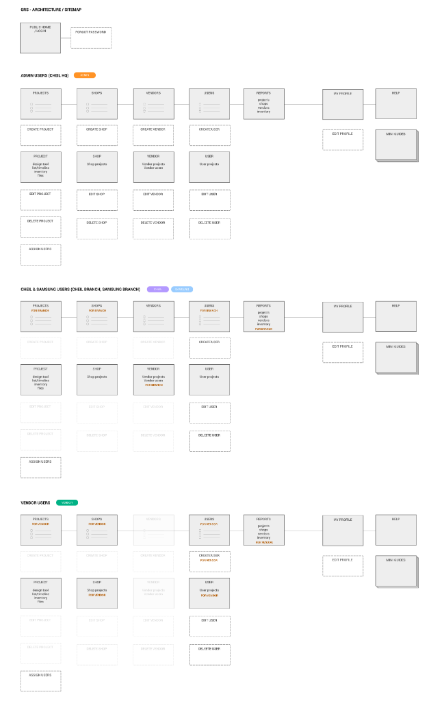
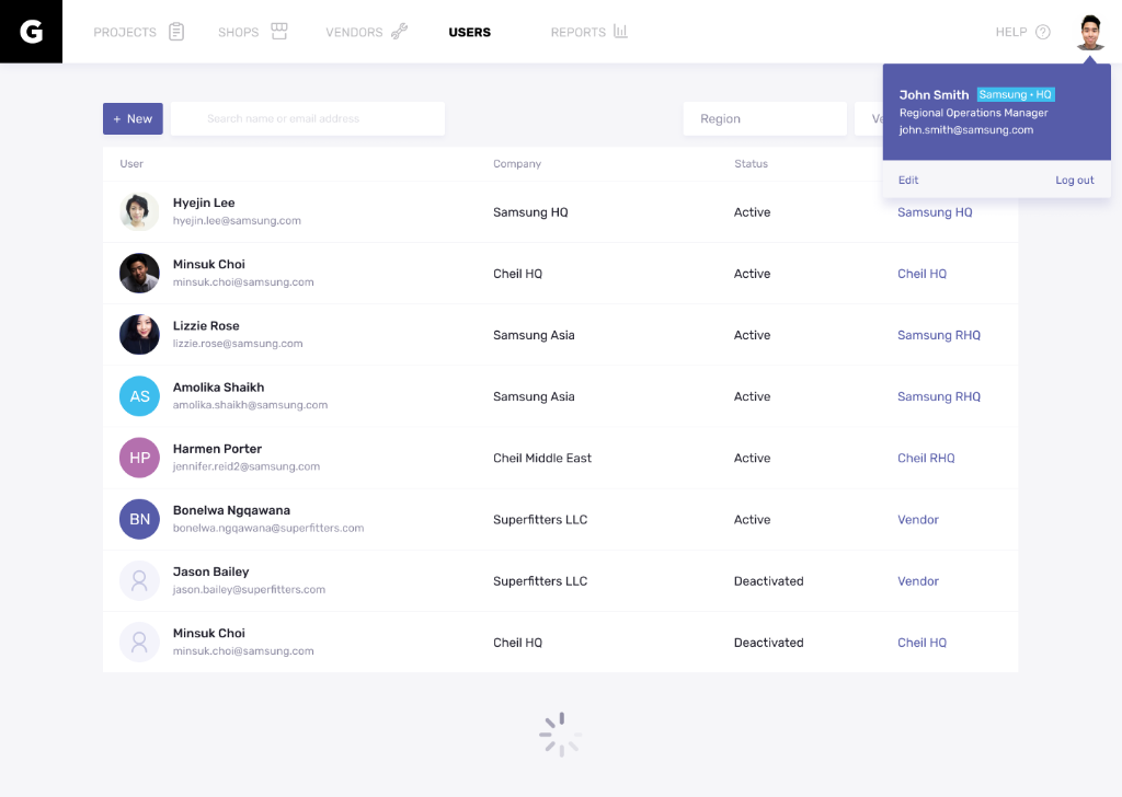
This dashboard is designed as a focused working environment, shaped around how each user operates. Access is structured by role so that users only see what is relevant to their responsibilities, reducing noise while maintaining clarity and system integrity. Three primary roles were defined: Admin (Cheil HQ), Branch Users (Cheil/Samsung), and Vendors, each with a level of access tailored to their scope.
Admin users have a complete view of the system, allowing them to monitor global project status, manage permissions, and oversee operations end to end. The interface adapts based on each user's role, simplifying the experience so they can review projects, track vendor progress, and make decisions quickly without being overwhelmed.
Filtering as Navigation
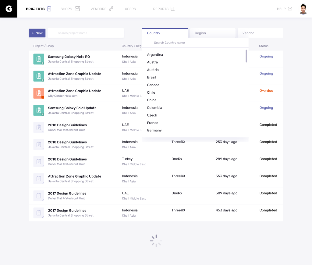
Instead of navigating across multiple pages, users refine their view through filtering.
Filters such as country, vendor, and status allow users to quickly narrow down large datasets. This approach keeps users in context while giving them precise control over what they want to see.
Task Tracking
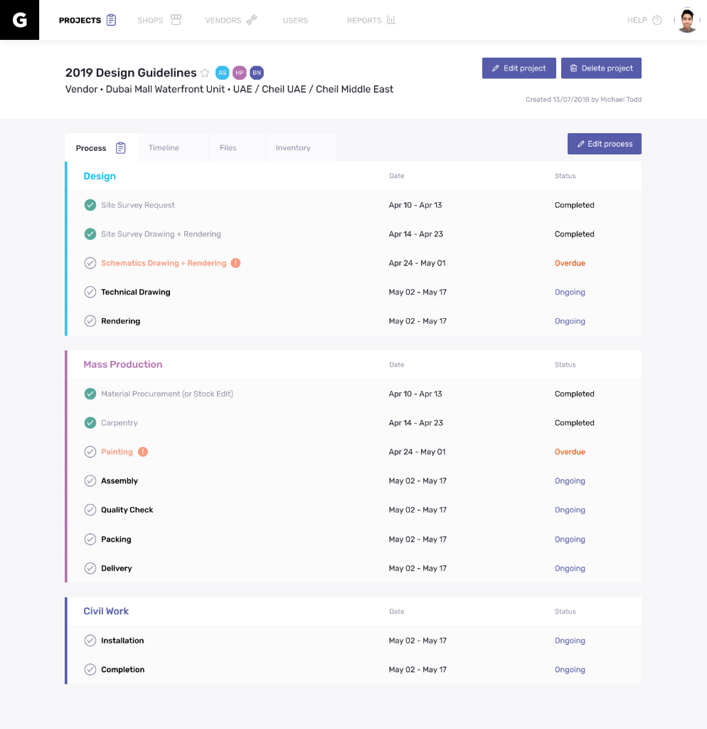
This page provides a structured view of each project's progress by organizing work into clear phases such as Design and Mass Production. Instead of a flat list, tasks are grouped to reflect the real workflow, with each step showing its timeline and current status, including Completed, Ongoing, or Overdue. This allows users to quickly understand where the project stands, identify delays, and take action without needing to piece together information from multiple sources.
Easy Vendor Management
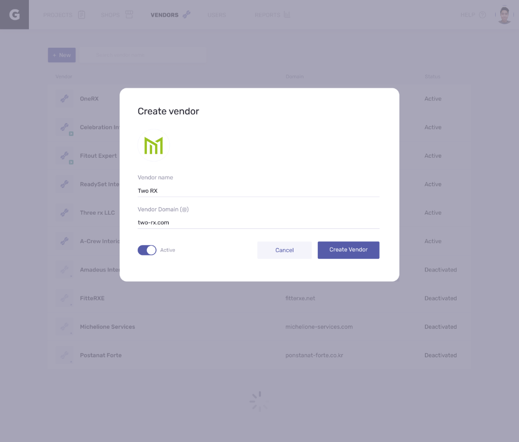
Adding and managing vendors is designed to be simple and lightweight. Users can create a new vendor through a focused modal without leaving the current page, entering key details such as name and domain while setting status in a single step. By keeping the interaction minimal and in context, the experience reduces friction and allows users to quickly onboard vendors without interrupting their workflow.
Track Projects Under Profile
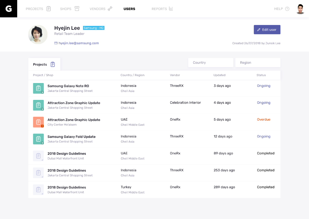
Projects are organized under each profile to provide a clear view of ownership and responsibility. Users can easily see which projects are assigned to them or associated with a specific vendor, along with their current status and progress. By connecting projects directly to profiles, the system creates a more transparent structure, making it easier to track work, understand accountability, and manage multiple projects without losing context.
Design Decisions
Several key decisions shaped the experience.
- A table-based layout was chosen over cards to support dense information and scalability.
- Modal interactions were used to keep users in context and reduce unnecessary navigation.
- Inputs were intentionally constrained to promote consistency and reduce ambiguity.
Each decision was made to support clarity, speed, and reliability.
Outcome
The platform introduced a more structured way of managing global store operations.
Teams were able to understand project status more quickly, coordination became more efficient, and store standards were easier to maintain across regions. The system reduced reliance on manual communication and provided a shared source of truth.
Next Project